Creating marketing materials that captivate and convert requires more than attractive visuals—it requires strategic thinking, brand consistency, and a firm grasp of production realities. Whether you’re producing brochures, product cards, event displays, or custom packaging, these printed assets often form the first tangible impression of your brand. Getting the design right is essential.
Below are 10 common design pitfalls and how the right print partner, such as SunTop Printing, helps ensure your materials stand out for the right reasons.
1. Using Low-Resolution or Unlicensed Images
Pixelated or improperly licensed visuals undermine credibility instantly. High-resolution, brand-appropriate photography—ideally original—sets the tone for professionalism and quality.
2. Overcrowded Layouts with No Breathing Room
Cluttered compositions overload the viewer and dilute your messaging. Strategic use of white space guides the eye and helps each element communicate clearly.
3. Inconsistent Brand Application
When fonts, colors, and tone vary across materials, brand recognition weakens. Maintaining strict consistency reinforces trust. Many teams reference a resource that offers structured creative guidance to keep visual standards aligned across campaigns.
4. Weak or Missing Calls to Action
Every printed asset must lead the audience somewhere—visit a page, scan a code, request a sample. CTAs should be concise, meaningful, and unmistakably clear.
5. Dense Text and Low Readability
Walls of text overwhelm readers. Break messaging into smaller sections, use headlines that communicate immediate value, and support scanning patterns common in modern audiences.
6. Ignoring Production Details
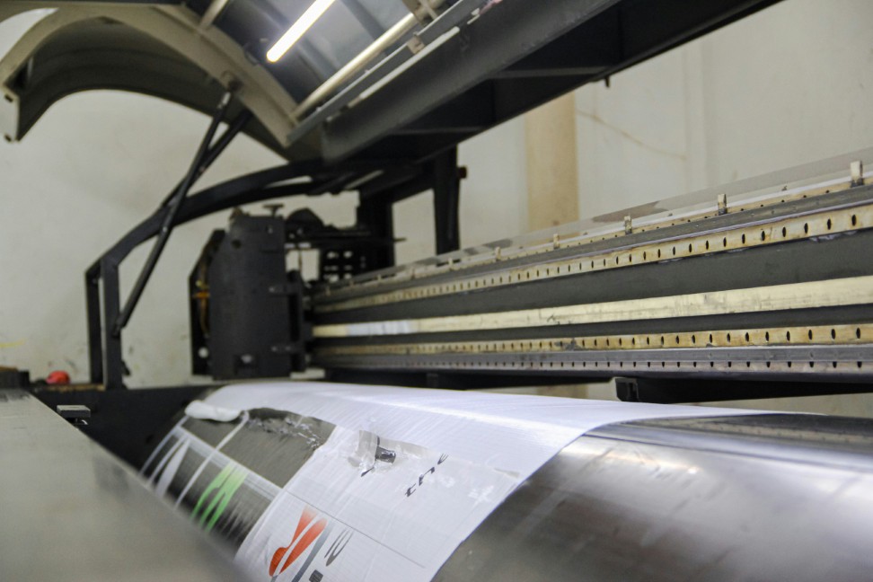
Even the best design falls flat with poor printing. Paper choice, coating, die-cut precision, and color management greatly influence perceived value. SunTop Printing uses Heidelberg presses and calibrated workflows to ensure designs translate flawlessly into print.
7. Insufficient Contrast or Poor Legibility
If text blends into backgrounds or lacks hierarchy, your message becomes inaccessible. Prioritize contrast, readability, and visual order in every layout.
8. Typography Missteps
Mixing too many fonts, misjudging line spacing, or forcing decorative type into functional roles creates distraction. Typography should reinforce brand tone while remaining effortlessly readable.
9. Overreliance on Generic Templates
Templates save time but rarely differentiate your brand. Custom design—supported by knowledgeable production teams—ensures your materials feel purposeful and distinctive.
10. Skipping Proofreading and Prepress
Typos, formatting errors, or misaligned elements can sabotage otherwise strong materials. Multiple proofreading rounds paired with professional prepress checks prevent costly mistakes before printing.
Final Thoughts
Impactful marketing materials are clear, polished, and strategically aligned with brand goals. Avoiding these ten pitfalls not only improves communication but strengthens brand perception and ROI.
With SunTop Printing as your production partner, you benefit from precise color control, dependable manufacturing, and experienced guidance at every step—so your printed materials always reflect your brand at its best.